 |
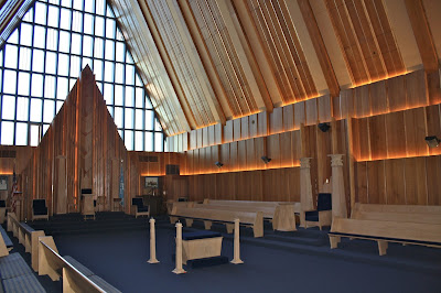
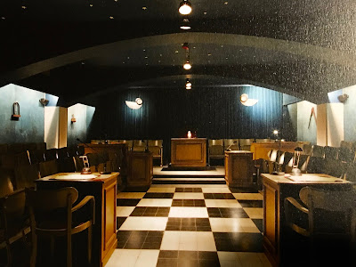
| New lodge room at the Grand Lodge of California |
(UPDATE: The room was designed by architect and Brother David Hackett. The Grand Lodge also added a dining area with bar, study and lounge with a functioning fireplace. in their remodel. Here are two more angles of the lodge room itself that brethren posted on my Facebook page since I first put up this story.)
Don't get me wrong - while I hate the cheap paneling nailed up in thousands of lodges like so many church recreation halls, insurance offices, garages, and basements throughout the fruited plain, I'm AM a big fan of the late 50s and early 60s contemporary architecture.
There's a gulf of difference between cheap junk nailed up to cover up a problem versus thoughtful design. For instance, the Grand Lodge of Pennsylvania's Masonic Village in Elizabethtown has one of the very coolest 1960s A-frame lodge rooms I've ever been in.
 |
| Lodge room at the Masonic Village in Elizabethtown, Pennsylvania |
 |
| Be honest - isn't it time to redecorate? |
If you are interested in reimagining your lodge room with a more contemporary approach, take a look at some modern French and Belgian lodge rooms. Many of their older rooms were wrecked during WWII under Nazi occupation throughout the country, so they had to build brand new ones or redecorate destroyed older ones. Plus, they are often in densely packed, tiny urban locations. They have MANY contemporary designs throughout those two nations. And their lodge rooms are designed for far fewer members than most of our older temples were.
For inspiration, I highly recommend two large format photo books packed full of their lodge room images:
Temples Maçonniques de France et de Belgique by Serge Moati and François Nussbaumer
A La Découverte des Temples Maçonniques de France by Ludovic Marcos and Ronan Loaëc
While expensive (the larger Marcos/Loaëc one has more examples), both are worth having. Both books contain new and older rooms with a huge variety of decor, plus many older rooms with updated contemporary designs.
Here are a couple of random examples.
Not every design appeals to every taste. One man's idea of impressive is another man's idea of a hotel lobby. But in earlier times, our brethren were not shy about personalizing their lodge buildings and meeting rooms with artwork, custom furniture, unique detailing, and innovative designs. That festive, decorative spirit generally did not flourish in the mid- and late-20th century throughout the US.
(Maybe it's because we pitched the booze out of so many jurisdictions...)
Notice how so very much in all of these examples is accomplished with lighting. Even plain white walls can become dramatic or soothing or otherwise evocative just with new, modern light sources and alternatives.
Think about the first time you actually walked into your current lodge room. Did it feel "special"? Did it feel like you were in a very different sort of place than anywhere else?
Didn't you WANT it to be?
Our lodge rooms are supposed to be a sanctuary from the outside world. They are supposed to make you feel like you are in a place that cannot be invaded by the problems outside the Tyler's door. They are supposed to make you feel like this is a unique place where important, comforting, reflective, and sometimes transformative things take place. All of the above examples accomplish that in a way that baby blue paint or basement paneling lit with flickering fluorescent tubes while a ceiling fan ticks overhead cannot.
Then, of course, there's another way to accomplish this besides paint, lights and furniture. The Scottish Rite Valley of Houston a few years ago built what amounts to a holodeck - a room surrounded on three sides by projection screens so that quite literally any backdrop or artwork can be displayed. Sixteen hi-def laser projectors are combined with computer generated wraparound imagery and a huge surround sound system. Virtual Reality Solomon's Temple anyone?
Just different ways of looking at it. Next time you walk in, try looking at your own lodge room with different eyes. And then make the most of it.


Redoing lodge rooms is not beyond the capacity of many lodges and it will pay off in membership and attendance. It is ironic that a fraternity whose past includes great architecture looks like a church basement rummage sale. We have to ask why all these things that should be done and are discussed on this site are not stirring the leadership: a simple answer is that the leadership are not leading.
ReplyDeleteThis is a great article.
ReplyDeleteI've been trying to have our cheap 1960s conference room renovatated for over two years now. I drew up the preliminary plans, rendered what it would look like. We have the money to redo something like that and more but our building was neglected and never really received the upkeep it needed in the 50 years it's been around. Oh well, I could only bring it up every month till we get it done.
Myrtle #108 in the once little timber town of Issaquah, Washington fell victim to a sale on powder blue paint, and wall decorations I'd best describe as "Bad Elvis Art".
ReplyDeleteThe building was erected at the turn of the 20th century, and our alter was put together with glorified 2x4s and nails.
When I showed my son the lodge, he said "I don't mind "Old". Harvard is old. Yale is old. This is just old, tired, dingy and shabby." And he was right on every account. It's time to face some reality here. Lodges shouldn't be a place where old Masons come to die in an old Lodge that is dying too.
We're making changes. I found wonderful old art in cheap shoddy frames, that had been tucked away for decades. It's now been professionally redone in good frames and museum glass so it won't fade.
A brother donated his apron collection from Lodges all around the world. We use these aprons in Lodge, and have a Scottish night, or a Irish night, or an English night.
We repainted those dingy, brassy looking pillars and replaced the globes with modern lighting. They look pretty darned good.
We created a library room. It's small, but it has wonderful books to loan Brothers in search of more light.
We painted the exterior of our building and hung a new sign that proclaims who we are. We're two block from the Police Department but there are officers here who never knew we were an active lodge. Now they do!
And there are other critical changes. No one comes to Lodge to hear the minutes and pay the bills and hear the WM talk to the Secretary for 40 minutes. That's why we are finished with the bureaucratic duties within a half hour of opening. We gather the chairs between the East and the Alter and "Shrink The Lodge" where we have an open forum about a wide range of topics. This ISN'T a lecture.It's a discussion that beings with a question, such as "How have you changed since becoming a Mason?"
There's lots more to do, and "miles to go before I sleep", but we're getting there.
Brother Hodapp, you visited Phoenix Lodge #131 in Nashville back in 2012 and many of your comments couldn't have been more reflective of our early 1960's building. The wood paneling, dingy lighting, yellow floors, walls stained with the cigarette smoke of 40+ years, etc. We have recently merged with another lodge and in doing so we have spent the last year fully "gutting" and renovating our building. I'd love to have you back sometime in the next year if your schedule permits to see what we have done and how a lodge can really embrace the mid-century modern architecture and design but be brought into the 2000's. Let's connect and I'll send you some pictures of how much it has changed. Thanks!
ReplyDelete