We had a saying around our film production studio for many, many years: "Where do great ideas come from? Somebody else!"
It's a fact of life that not every Masonic temple can be blessed with being architecturally distinctive. In fact, it's the rare Masonic hall built after World War II that isn't either plain, ugly, boring, or downright ghastly.
The featureless glass-wall front entrance to Porter Lodge 137 in Valparaiso, Indiana is typical for late 1950s and 60s generic storefront buildings. At first glance, it could be an accountant's office, a dental clinic, a social security administration branch, or a hundred other types of offices or stores. There was little about it that instantly identified it as a Masonic lodge unless you saw the square and compass signs up at the roofline - which is actually hard to do if you're driving down the street or walking on the sidewalk.
In fact, the first time I visited the lodge in northern Indiana, I blasted right past it.
Twice.
That's not true any more. Thanks to the artistic design abilities of WB John Bridegroom (art director of the Journal of the Masonic Society and proprietor of The Master's Craft, supplier of custom Masonic jewels and more), the lodge's glass foyer was transformed into a truly unique entryway through the miracle of vinyl graphics.
These graphics act as 24/7 messengers to the public, whether they are providing information or just simply creating a sense of intrigue and wonder to a curious public.
That's not true any more. Thanks to the artistic design abilities of WB John Bridegroom (art director of the Journal of the Masonic Society and proprietor of The Master's Craft, supplier of custom Masonic jewels and more), the lodge's glass foyer was transformed into a truly unique entryway through the miracle of vinyl graphics.
The actual printing and installation of the vinyl graphics was donated to the lodge by WB Zeno Rossetti.
The result is stunning, and remarkably inexpensive when you consider the enormity of the impact it makes. Now there's no mistaking what this doorway leads to.
If these particular graphics aren't to your taste or liking, that's okay. Start with a blank sheet of paper or a new Photoshop document, and create one that's more suitable for your lodge. The point is that for just a few hundred dollars, a big graphic like this can completely transform your temple building. And if you hate it next year, the vinyl makes it easy to remove and create a new one!
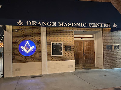
If your town has lots of foot traffic, the downstairs entry to your temple offers the potential to be both welcoming and informative, even if there's no one inside and the doors are locked. For instance, Orange Grove Lodge 293 in Orange, California sits on a prominent corner on their town square. A Chase bank branch occupies the ground floor, and the lodge is upstairs.
On weekends, the street is often shut down to cars and turned into a pedestrian mall with outdoor dining. So the lodge uses its glass doors to provide a short FAQ to the public: what's Freemasonry about; what's the point; who can join; the lodge website and Facebook addresses; and who to contact for more information.
On the town square side of the building is the more formal entry to the lodge and Masonic Center upstairs. Instead of more signage, they have a large, circular painted-glass square and compass right at eye level. The symbol is illuminated at night and easy to spot from across the street.
These graphics act as 24/7 messengers to the public, whether they are providing information or just simply creating a sense of intrigue and wonder to a curious public.
We still have some members today who cling to the notion that Masons shouldn't ever do anything that even smells like advertising or promotion. This is, of course, balderdash. If you really think our brethren in the 19th century didn't advertise the fraternity, I offer this image of the downtown Masonic temple in Boston in 1895. Bold enough in daylight, it was festooned in so many electric lights that you could have spotted it from low Earth orbit (if you could get there somehow).


Brilliant idea!
ReplyDeleteGood posting. The first pictured example illustrating a figure with the index finger pressed to the lips is popular,in some form, among one or two of the several Rosicrucian Orders which still exist today. So Freemasons,proper,and potential Craft candidates, are not the only ones who will recognize or be attracted to such wonderful symbolism. Very nice.
ReplyDeleteThank you so much for this. I sent a copy of your article to our WM as a congratulations, because he is advancing the same program. He and a group of the Brothers came up with (relatively) inexpensive ways to transform our office-park lodge into something truly Masonic.
ReplyDeleteEven facades countsas architecture, as you have illustrated in your excellent blog post.
EL, MM Gainesville No. 41